
No matter what line of work we are in, there is that air of mystery and awe when we look at someone in a flight, in a suit working on their laptop early in the morning. This person, very often, turns out to be a consultant.
As consultants go, the crème de la crème of this field is the management consultants, armed with their cutting edge PPT skills and their gift of the gab, they set the industry standards of how data is presented. Their rules of thumb are often what make their presentations a class apart from the others, and here is why.
- BALANCING DATA
Consultants cite their rule of 3, and other such rules of how much data is important to be presented at a given time. They never make the mistake of presenting all the data that is available and even relevant. Every piece of information has to fight to be added to the presentation, prove its worth, and so only the best of the best information reaches the PPT, which creates a good limit to the data.
Their presentations are driven towards change, and therefore stories are of the essence with them. They connect the viewer to the data rather than just presenting data.
- LINKING HEADINGS
Every heading that is added to a slide should contain a message, and the contents of the slide prove the message. That link makes the flow very easy to follow and ensures that there is a coherence in the PPT. Another expert tip is, once you have an entire presentation put together, go slide-by-slide and copy every single headline into a separate document and read them in order and see if it makes sense or tells a story
- STRUCTURE
Logical flow is one of the most important aspects of information presentation in slides. One principle that they use for that is known as the Minto Pyramid Principle, by Barbara Minto. In this logic, the slides are structured as follows:
- Page 1 = executive summary
- Page 2-4 = recommendation #1 and supporting facts
- Page 5-7 = recommendation #2 and supporting facts
In this way, the PPT begins with the conclusion, which helps to cut to the chase quickly. The information is streamlined, focused and logical. It is an efficient top-down approach to presenting information, as opposed to the bottom-up approach of reports, with the conclusion at the end.
- FORMAT
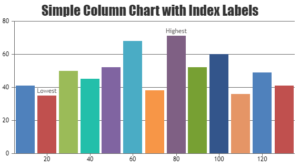
Every consultancy worth its name has a clear set of design principles that make sure data is presented in the most efficient, clear and clean way. Not just with slides and text, this is important when it comes to data presentation as well. Every type of information and audience has a single method / chart that will present it the best and it is important to think about that well and format data in the right and relevant way.

These are a few of the many things that lead to the crisp, clean and professional presentations that management consultants have to their name (and CV). These tips could change the way you present data, and teach you a thing or two. Go forth and present like a consultant!