If expert data presentation is the game, tables and charts are the game.
Charts are what you use to add life to your numbers, show comparisons effectively and make the presentation make sense to even laypeople. Charts are of different types, and each type serves a purpose that is unique. It is the mark of an expert to use charts and graphs in their appropriate way, for exactly the kind of data they were meant to represent, and it eases the understanding of the viewer greatly.
Following are the types of common charts and their perfect usages:
- LINE GRAPH
A line graph consists of the X & Y axes with two lines representing data on it. They are used to track changes over time (mostly long changes).
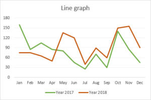
Use this when there is a strong component of change, time or trends in your data. Line charts can be used for smaller trends as well. You should use it when you chart a continuous data set.
- PIE CHART
Pie charts are used to understand parts of a whole. They are used for static data and not for changes over time.
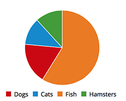
Use this when the total of a given data is 100, a percent, or that two sets of data have the same whole / total value.
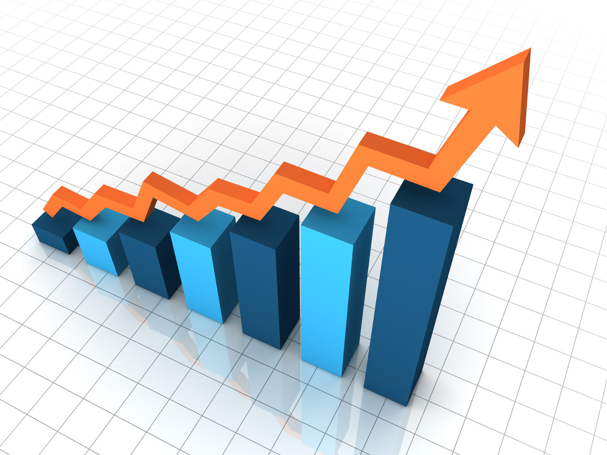
- BAR GRAPH
Bar graphs are used to compare different groups, that have changes over time. The changes here are usually over a longer period of time.
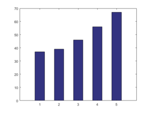
Use this to to avoid clutter when one data label is long or if you have more than 10 items to compare. This type of visualization can also be used to display negative numbers.
- AREA GRAPH
Area graphs are very similar to line graphs. They can be used to track changes over time for one or more groups. Area graphs are good to use when you are tracking the changes in two or more related groups that make up one whole category (for example public and private groups).
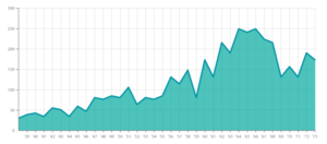
Use this for showing part-to-whole relations, such as showing individual sales reps’ contribution to total sales for a year. It helps you analyze both overall and individual trend information.
- X/Y PLOT
These are used to determine relationships between 2 things that are different. Here, the X axis is used to measure one thing and the Y axis is used to measure another thing. If both variables increase at the same time, they have a positive relationship. If one variable decreases while the other increases, they have a negative relationship. Sometimes the variables don’t follow any pattern and have no relationship.
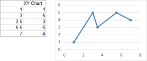
Use this when there is a relation between two sets of data but it could go in any direction, and the two sets are qualitatively different. This should be used to visualize a correlation or the lack thereof between data sets.