

Healthcare is generating more data than ever from clinical trials and patient records to research findings and real-world health trends. But data alone does not create understanding. The real challenge is turning millions of data points into simple, meaningful stories that people can quickly understand and act on.
New healthcare visualization techniques are helping scientists, clinicians, and business teams see patterns, explain discoveries, and make better decisions. At SlideXpress, we help transform complex healthcare information into engaging visual experiences through presentations, infographics, animations, and digital storytelling.
Seeing the Bigger Picture With Interactive Geospatial Mapping
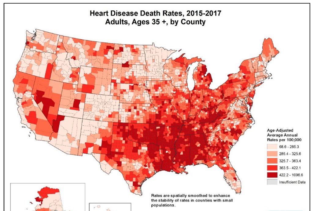
Healthcare insights are often connected to where something happens. Interactive maps help visualize disease trends, patient populations, healthcare access, and regional differences in a way that feels intuitive.
Instead of scanning through endless spreadsheets, teams can explore patterns visually — making it easier to identify opportunities, challenges, and areas that need attention.
Making Healthcare Decisions Faster With Real-Time Dashboards
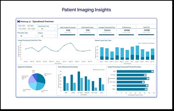
Real-time dashboards bring important information into one place. They combine clinical data, performance metrics, and key health indicators into simple visual views that help teams track what is happening and respond quickly.
A good dashboard is not about showing more data — it is about showing the right data at the right time.
Using Predictive Models Without Losing the Human Perspective

Predictive models can help identify possible trends, risks, and outcomes by analyzing existing healthcare data. They can support areas such as patient monitoring, treatment planning, and resource management.
However, insights are only useful when people can understand them. Clear visuals, context, and human interpretation remain essential to turning predictions into meaningful decisions.
New Ways Healthcare Stories Are Being Visualized
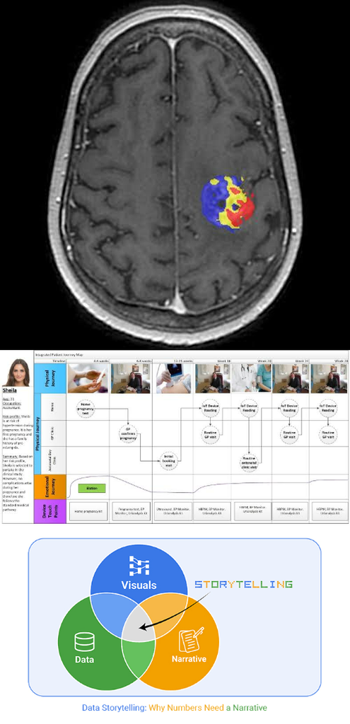
3D Medical Visualization: Bringing biology to life through interactive models of organs, molecules, and treatment mechanisms.
Patient Journey Mapping: Showing the complete healthcare experience — from symptoms and diagnosis to treatment and outcomes.
Data Storytelling: Combining visuals, context, and narrative to make complex scientific information easier to understand.
SlideXpress: Making Healthcare Data More Human
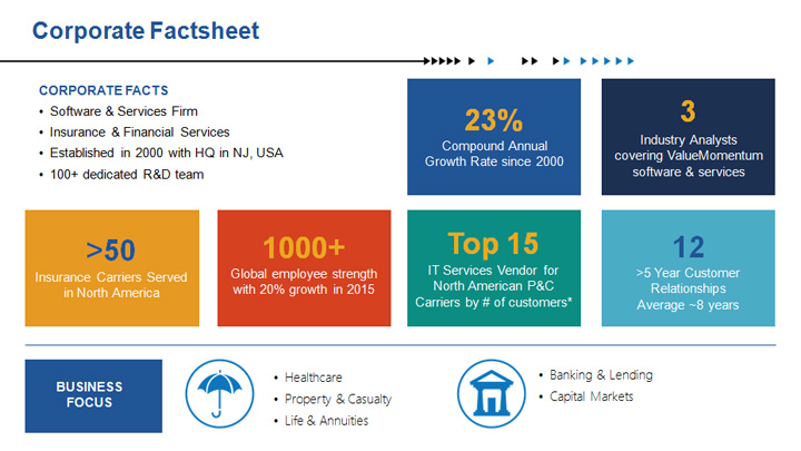
Healthcare information can be complex, but communication does not have to be. At SlideXpress, we combine science, strategy, and design to turn complex healthcare data into stories that connect with audiences.
Because the goal is not just to present information it is to create understanding.