
Understanding qualitative information is critical in business, UX, and analytics. While traditional tables and text can convey data, visual methods make insights faster and easier to grasp. Here are some modern techniques widely used today.
1. Iconography & Symbols
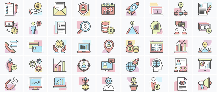
Icons provide an immediate visual cue. Harvey Balls, checkmarks, and simple pictograms communicate status, completion, or quality at a glance. For instance, a full Harvey Ball can indicate a fully achieved goal, while a half-filled one signals partial completion.
2. Heatmaps & Color Gradients

Color intensity adds depth to qualitative data. Heatmaps allow viewers to see patterns and prioritize quickly. Darker shades can represent higher relevance or risk, while lighter shades indicate lower importance. This method is especially effective in large tables or dashboards.
3. Radar/Spider Charts
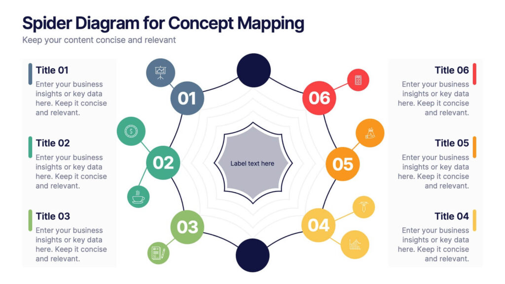
Radar charts plot multiple qualitative attributes on a radial grid, showing how an entity performs across several dimensions. Commonly used for skills assessment or product comparison, these charts make relative strengths and weaknesses immediately visible.
4. Dot Plots & Bubble Charts
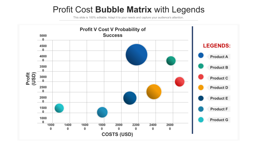
Dots and bubbles represent data points, often with size or color indicating a secondary attribute. For example, a bubble chart could show product popularity (dot size) and customer satisfaction (color), giving a multi-dimensional perspective in a single visual.
5. Likert Scales & Icon Scales
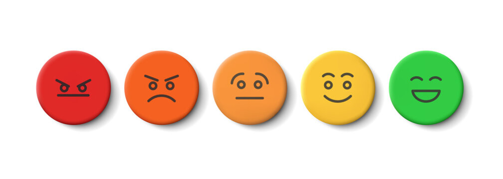
These scales convert opinions or ratings into visual formats, such as stars, thumbs up/down, or sliders. They are widely used in surveys, user research, and feedback forms, offering a clear sense of sentiment or preference at a glance.
Conclusion
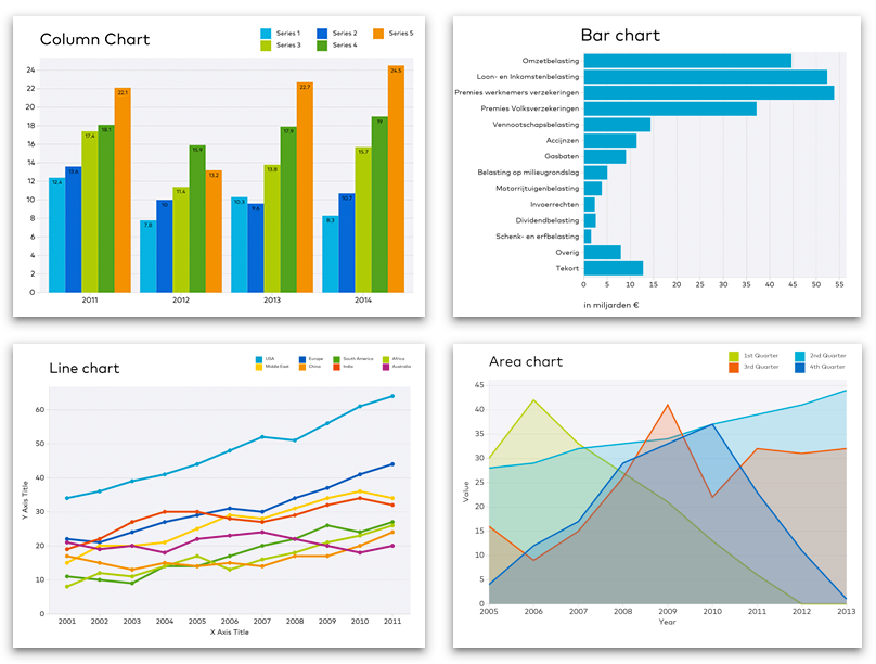
Modern qualitative visualization emphasizes clarity and immediacy. By leveraging icons, colors, shapes, and scales, organizations can present complex qualitative information in a way that is actionable and decision-ready. Choosing the right method depends on the context, the number of dimensions, and the audience’s need for quick insights.