Stick with the classics… here’s why you need to.
With the surplus of new extravagant fonts and flashy images, animations and videos people tend to forget that less is more. Using over the top decorations and multimedia could distract your audience and you from the main point of the presentation.
In certain cases, keeping a basic, classic and simple presentation can prove to be an effective mode of communication and flow of discourse.
[Here are some pointers in case you’ve forgotten the timeless PowerPoint topics]
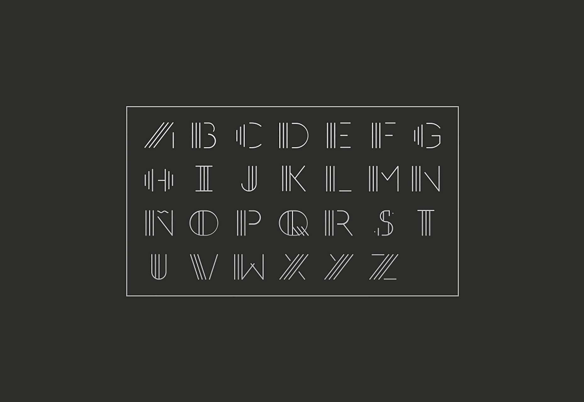
- Use the classic fonts – many people dislike the old fonts like Helvetica, Arial, or Calibri only because they feel they are outdated. There is a reason as to why they were popular in the first place- they are basic, easy-to-read fonts that are legible and do not strain the audiences eyes.
- Additionally, using the sans serif texts for the body of your content is coming back in style
- Simple fonts take less time to read than compared to modern fonts which has lesser readability.
- Simple font minimises the effort needed to read the content on the screen
So, simple fonts really do make a difference. They increase efficiency and do not elongate your PowerPoint