Ever noticed how certain brands are instantly recognizable just by their colors? Think Coca-Cola’s bold red, Starbucks’ calming green, or Tiffany’s signature blue. That’s not a coincidence—it’s color psychology at work. Colors don’t just make things look pretty; they shape how we feel and how we connect with a brand.
Colors Speak Louder Than Words
Every color tells a story. Red grabs attention and creates excitement. Blue feels calm and trustworthy, perfect for banks or tech companies that want you to feel safe with them. Yellow radiates happiness and positivity, while green screams health, nature, and balance. Without saying a word, colors trigger emotions that influence how we see a brand.
Building a Brand’s Personality

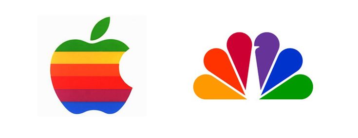
Colors are like a brand’s wardrobe—they create a signature look that sticks in people’s minds. Imagine McDonald’s without the golden arches or Nike without that white Swoosh. Hard to picture, right? When brands consistently use the same color palette, they carve out a unique identity that feels familiar and trustworthy.
Context Matters

What makes color psychology complex is that cultural context, personal experiences, and individual differences also shape color perception. In the West, white is about purity and weddings, but in some Asian cultures, it’s tied to mourning. Purple may scream luxury in one place but spirituality in another. That’s why global brands need to be smart and thoughtful with their color choices.
More Than Just a Logo
The magic of color doesn’t stop at the logo. It flows into websites, packaging, ads, and even store designs. Warm colors can spark quick decisions, while cool shades make people linger longer. Marketers use this psychology to guide how customers feel and act.
Colors aren’t just decoration—they’re powerful tools that can make or break how people connect with a brand. Choosing the right palette means choosing the right emotions.