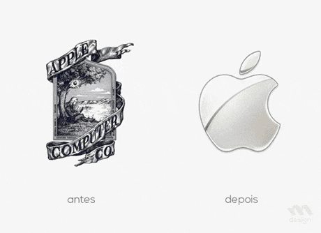
Some logos don’t just represent a brand — they define an era. Think of Starbucks’ twin-tailed siren, Adidas’ three stripes, or Coca-Cola’s flowing script. Decades later, they’re still everywhere, still relevant, and still instantly recognizable. So, what gives these designs their timeless magic?
Simplicity Never Gets Old
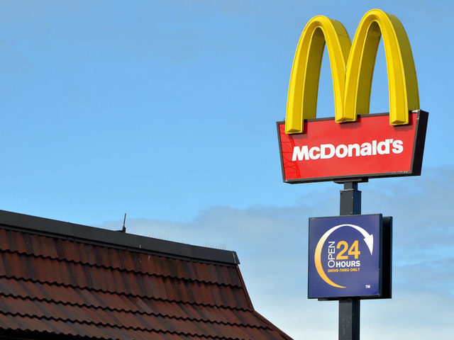
The best logos are bold, clean, and easy to recall — even when shrunk to a phone icon or splashed across a billboard. The McDonald’s golden arches or Mercedes-Benz’s star prove that less truly is more. Minimal designs age slower because they rely on clarity, not trends.
Meaning Builds Connection
Great logos tell a story without saying a word. The Starbucks siren evokes comfort and community, while Adidas’ three stripes suggest strength and progress. These designs tap into emotion — the one thing that never goes out of style.
Adaptability Keeps Them Fresh
The world changes fast, and so do design trends. Timeless logos evolve subtly — like Google’s clean lettering or Pepsi’s refreshed globe — keeping their essence while staying current. It’s evolution, not reinvention.
Connection Creates Legacy
The most iconic logos cross languages, cultures, and generations. They’re not just graphics — they’re statements, moods, and memories. Whether on sneakers, coffee cups, or screens, these marks trigger instant recognition and emotion.
Timeless logos tell stories. Evolving without losing their essence, they prove that great design is not about trends but about emotion, clarity, and connection.