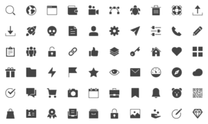
If you’ve seen a designer’s report or presentation, you must have noticed one feature that sets them apart – iconography. Iconography is the use of visual images and symbols and interpretation of those. In reports and presentations, iconography is used to supplement headings and topics to break the monotony of text and solidify meanings.
![]()
So how does one use icons efficiently to transform reports and presentations?
STEP 1: UNDERSTAND YOUR INFORMATION
Icons are, first and foremost, tools to supplement data. In that respect, the information is the most important thing. In order to choose icons that are well placed and meaningful, one needs to understand the data well. The gist of the entire information can be pulled out and understood in the form of one relevant image, and that is the best icon for the slide/paragraph. Make sure you understand what the point of the information is, what you are writing, and why.
STEP 2: VISUALISE YOUR ICON
Once you pick the paragraph that you wish to portray, think about what image would go best. An ideal image that would go might be something intricate, but icons are simple. Break down what you think the information portrays into smaller and smaller elements until your final thought has only one uncomplicated image – maybe a tree, a set of gears, a computer monitor, and so on.
STEP 3: SEARCH FOR YOUR ICON
Once you have the image of your icon ready, it’s time to find the exact icon you’re looking for. Websites like www.fontawesome.com, www.flaticon.com, www.fontawesome.com/icons, are some resources where a library of basic icons in many formats can be found. A simple google search with the word icon can also work. Consider that a good icon is something that is simple, easy to understand across cultures and languages, and not ambiguous in meaning. Choose the icon that seems to you as the most relevant and intuitive one.
![]()
STEP 4: INTEGRATE YOUR ICON
These icons can be saved (preferable in PNG format) to a folder on your computer and easily copied into your presentation / report. Place the icon in a way that it does not steal the focus from the information but just supplements it. Try different placement – above, on the left – before you finalise but keep the placement consistent for every set of similar information. Keep the icons of similar colour and style for each section, to maintain harmony of the document.
STEP 5: CHECK THE OVERALL RELEVANCE
Wait! You’re not done yet. Once all the icons are added and you’re at the last stage of your iconographic document, you need to go over all your entire report and make sure there is coherence between the icons and the information. Best to ask an outsider to go over it as well, since they might have different views as a fresh pair of eyes.
This may seem daunting now, but the process becomes much speedier with experience, and in no time you’ll be making beautiful reports and integrating expert iconography with ease.