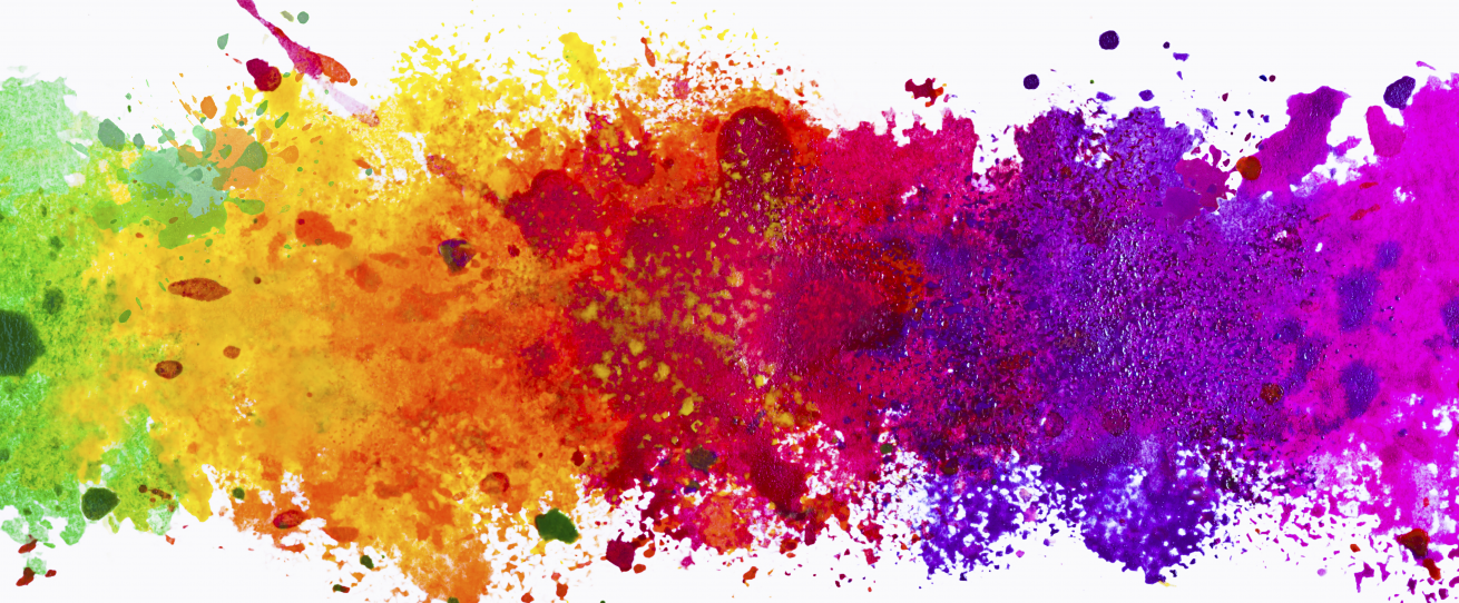
Color is one of the most powerful and obvious elements we have at our disposal to produce good design. Here is a base to understand colour definitions:
Hue – the descriptive name of the color. eg. Red, Green, Orange, Pink are all Hues.
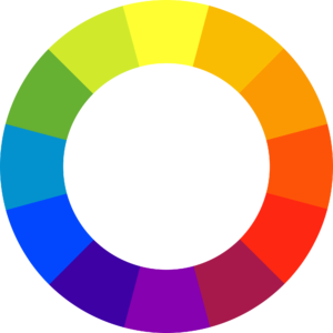
Primary Color – Red, Yellow and Blue, the only three pigments that cant be mixed from other pigments. These are the basis of all other colors.
Secondary Color – Orange, Green and Violet – Three colors falling half way between each or the primaries and containing a mixture of only two primaries.
Tertiary Color – a color between each primary and its adjacent secondary eg. Red/Orange between Red and Orange.
Saturated Color – a color containing no more than two primaries and no black or white.
Compound Color – a color containing a mixture of the three primaries eg. brown, khaki, yellow ochre, Burnt Sienna.
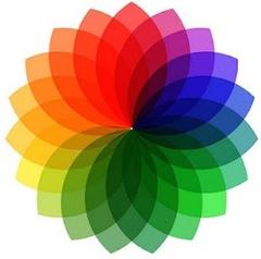
Complementary Color – opposite colors on the color wheel. eg. Red/Green, Yellow/Violet
Harmonious Color – adjacent colors on the color wheel eg. Yellow/ Green, Green and Blue/Green.
Analogous Colors – Colors beside each other on the color wheel.
Value or Tone – The lightness or darkness of a color eg. Yellow is a high value (or light tone) color. Violet is a low value (or dark tone) color.
Shade – any color with black added.
Tint – any color with white added.
Warm Colors – Red, orange and yellow. These are the colors of fire.
Cool Colors – Green, blue, and violet. These are the colors of water.
This is a lot of definitions to take in, but what can we do with this? There are many ways in which designers can use colours to their advantage in projects.
- Analogous Colours can be used for harmonies
- Complementary Colours are used for contrasting, to allow one color to dominate another or stand out
- Colour triads are formed by pairingtwo complementaries, then replacing one of these with the two colors either side of it. The warm/cool colours can dominate and the other one can create a pop
- The colour ripple effect of placing together complimentary colors of the same tonal value, is a technique used to animate an area of a painting or design. For the effect to work the tones must be identical.
- By mixing warm and cool colors you can create depth in your design.