The second element of note in our “Design Elements” series is Type.
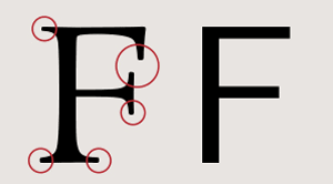
Type design is something that can be intimidating to many, with complicated terminology like kerning, ascender, tail, baseline, leading, etc. to accompany it. Don’t worry, we’ll get there but first we will start with the 8 basic typographical design elements:
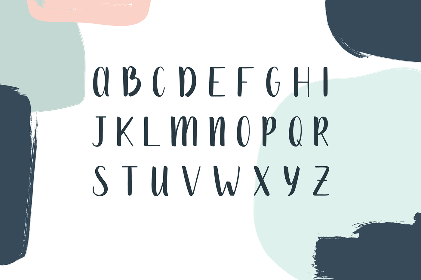
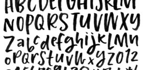
- TYPEFACE
There are 3 basic types of typefaces – serif, sans-serif and decorative. Serif fonts have the end of letter artistic flicks, sans-serif don’t and decorative fonts are elaborate and used for titles. The rule of thumb is to use max. 3, and ideally 2 fonts per design project. Pair serif with sans-serif and sometimes use decorative for headings (never body text)
- HEIRARCHY
The information heirarchy is very important when it comes to coherance of information. This heirarchy is also commmunicated through fonts. Headings are often in decorative / larger fonts. This is a visual cue that helps readers understand breaks in flow and labels. Having the same colour/size/font overall with no callouts or headings is monotonous, confusing and is bad design. Good heirarchy also makes your text scanable – allowing people to skim through large bodies of text quickly and picking out elements of their interest.
- CONTRAST
Varying size, typeface, weight, color, and style can give your designs a big impact as well as make your ideas organized. Using these wisely would result in a pleasant experience where elements stand out as desired
- CONSISTENCY
Fonts must be consistency along the entire project, else it can be confusing and messy. Contrast and heirarchy are only factors when one wants a break in the text. The general font families, colours, weights, etc. should be consistent along the entire file. Even when there are numerous heirarchies, it is important that there is an overall design theme.
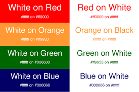
- COLOUR
We have covered the types of colours in the previous post, but in addition to that when it comes to type we ask ourselves whether the text is readable or not. This depends not only on the type colour but also the background colour. For example, white on black is more difficult to read than black on white. A good way to tell if your colors have enough contrast is to view your design in grayscale and if it doesn’t look good you may need to tweak values.
Thus we see how type is treated in design and how it can be used as an advantage in designing well.