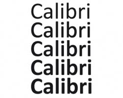
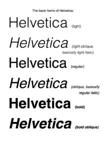
When we come to give a presentation, our aim is to stand out. Nobody goes with the aim to blend into the crowd. But, when you turn on your laptop and project the same standard PPT with a standard Helvetica / Calibri / Times New Roman font, you’ve lost a valuable opportunity to stand out and impress your viewers at the get-go.

Using a default font implies that you didn’t take the time out to break fre e usual boring way to do things. Slight change in your typography can go a long way in making your documents stand out. Fonts are a powerful design element, as much as colour and the use of images.
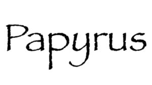
It’s important to strike a balance, though. Nobody wants to look up to the projector and see PAPYRUS, the cramped, unreadable archaic novelty font, or a horrifying text with dripping globules of blood on all sides. This would be an immediate disgust response in your audience / investors and would make you seem childish and unimpressive.
There are subtle fonts you can use in your PPTs that are professional as well as refreshing.
FOR SANS-SERIF FONTS:
- OPEN SANS
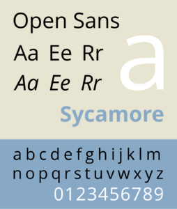
This font is one of the most widespread used fonts of the decade. Created by Google, it moves towards the lightweight and is used widely in websites and has been replacing default fonts for a long time.
- ALEGREYA SANS
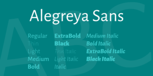
This font is more for headers, as it is a capitalised font. It is a version of Impact, and shouldn’t be used in body copy as it can come across as aggressive. Another similar option is Bebas Neue.
- HELVETICA NEUE
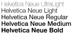
Since Helvetica is overdone, we can move to this font that has been used widely by Apple in their iOS 7 update. It has ultralight and medium variants as well now.
- RALEWAY
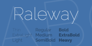
Since Helvetica is paid, Raleway is a good free alternative for it. It specialises in thin and normal versions and is good for titles and short amounts of text.
- FUTURA
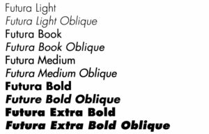
This font was created in 1927? Yet this geometric font remains faithful to its name’s premise: it is a timeless, avant-garde looking font.
- LATO
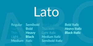
Lato’s thin profiles and smooth curves give the font a sophisticated look, while it also maintains great readability.
FOR SERIF FONTS:
- ROBOTO SLAB
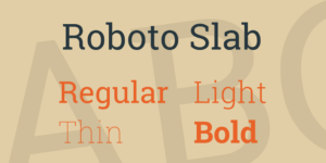
This font has beautiful right-angled serifs, giving a sense of elegance.
- CENTABEL BOOK
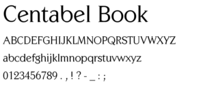
This font has pointy minimal serifs, making it a good way to add serifs without an excessive archaic look
- GEORGIA
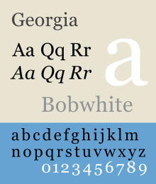
A default typeface for Microsoft, this is a good substitute for Times and other serif fonts.
In general, using Sans-Serif fonts is a better idea if one aims for readability and professionalism.