Having acknowledged the importance of words and improving the word-power of your PowerPoint presentation over the last few posts, today we will acknowledge the wisdom of the well-known saying: “A picture is worth a thousand words”…
However – and this is something we sometimes forget – that’s true only if the picture is chosen with great care.
Here are some things we’ve learnt about how to make the image click!
- Avoid the obvious
Don’t use the first thing that pops into your head.
Like the picture of a light bulb for a presentation on smart ideas:
That’s boring!
The same idea, with tweaks, will work better, for example:
Or:
Or even in another, less-expected, rendition:
- Dig deep
When we’re in a hurry, the urge is to go for the first pictures that show up when we type in a keyword. Restrain that urge and scroll down where the less expected and more impactful images will be.
For example, if your keyword is KNOWLEDGE, you could use the tried-and-tested:
Books of course!
Books, however interestingly shot, might not make as much of an impact as an image showing a person immersed in doing something he/she knows really well… and has a passion for.
For example:
Or, represents the beginning of a journey towards knowledge, and how we never stop learning:
- Think lateral
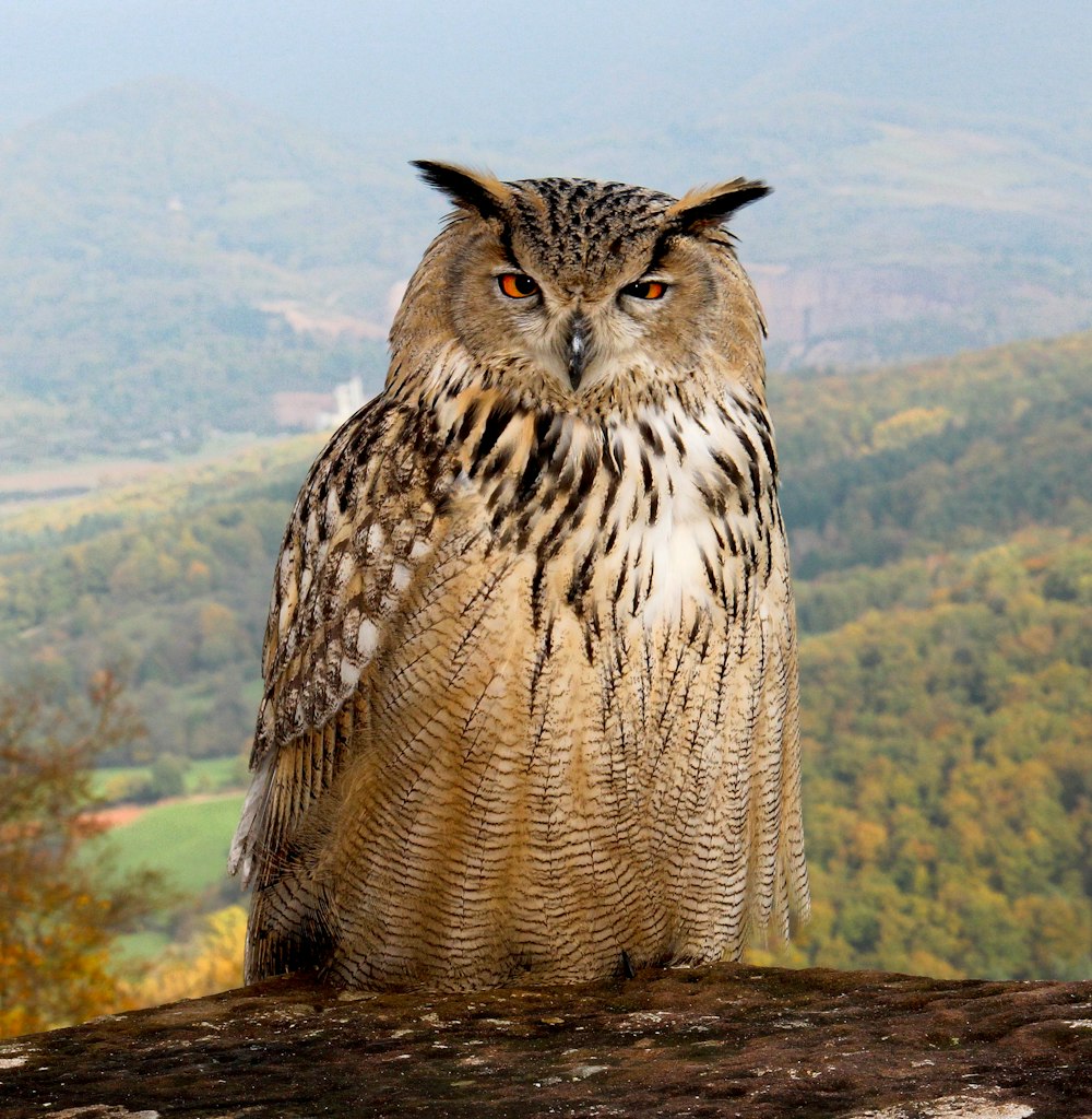
Staying with the “knowledge” metaphor, one way to take it further would be to symbolize knowledge differently, like so:
Don’t they always say: “as wise as an owl”? If you choose your images wisely and well, each slide will stand out.
- Be bold
What if, for knowledge, instead of picking any of the images above, you went for this one:
Drastic, right? Right. And it would be wrong to use this if the attempt was to provoke for the sake of provoking!
However, if this linked up to the idea that before we can accept new ideas, we have to do away with the old (especially the conventional ones that confine us) – then it would work!
Bold images show an appetite for risk and unconventional thinking, but will work only if you have a sound logic for using them and can defend their use in the presentation!
- Mix and match
If all your images are in the same category (be it boring and conventional, or radical and unconventional) – the overall effect will become predictable. Don’t put all your eggs in the same basket, i.e. vary your strategies according to the point being made per slide…
For example, suppose you want to demonstrate RISK, then why not use a range of images:
Each image tells the same story differently.
And that’s the power you want to tap into.
Happy hunting!


